Hands-on session 3: Designing accessible biological data visualization
This hands-on session focuses on designing accessible biological data visualization.
Overview
- You will learn accessibility guidelines for biological visualizations.
- These guidelines are based on Chartability (Elavsky et al.).
- (Activity) You will evaluate two biological data visualizations using the guidelines.
Chartability (website)
- A set of heuristics for ensuring the accessibility of data visualizations and interfaces
- Helpful for both accessibility experts and novices
- We mainly use “critical” heuristics
“Critical” Checklist
- Low contrast
- Small text size
- No explanation for purpose or for how to read
- No title, summary, or caption
- Data density is inappropriate
Color
- Must have a contrast ratio of at least 4.5:1 (Contrast Checker)
- Use colorblindness-friendly palette (e.g., okabe-ito)
- Human cannot easily differentiate more than 10 colors
- If necessary, group and filter categories
- Avoid using colors only
- Different shapes of mark
- Bar charts with different textures
Textual Descriptions
- Title, summary, or caption
- Axis labels
- Legend labels
“Critical” Checklist for Interactive Charts
- Interaction modality only has one input type
- No interaction cues or instructions
- No data table or spreadsheet
- Navigation and interaction is tedious
Activity (15 mins)
Evaluate the accessibility of two biological visualizations using Google Form (Link).
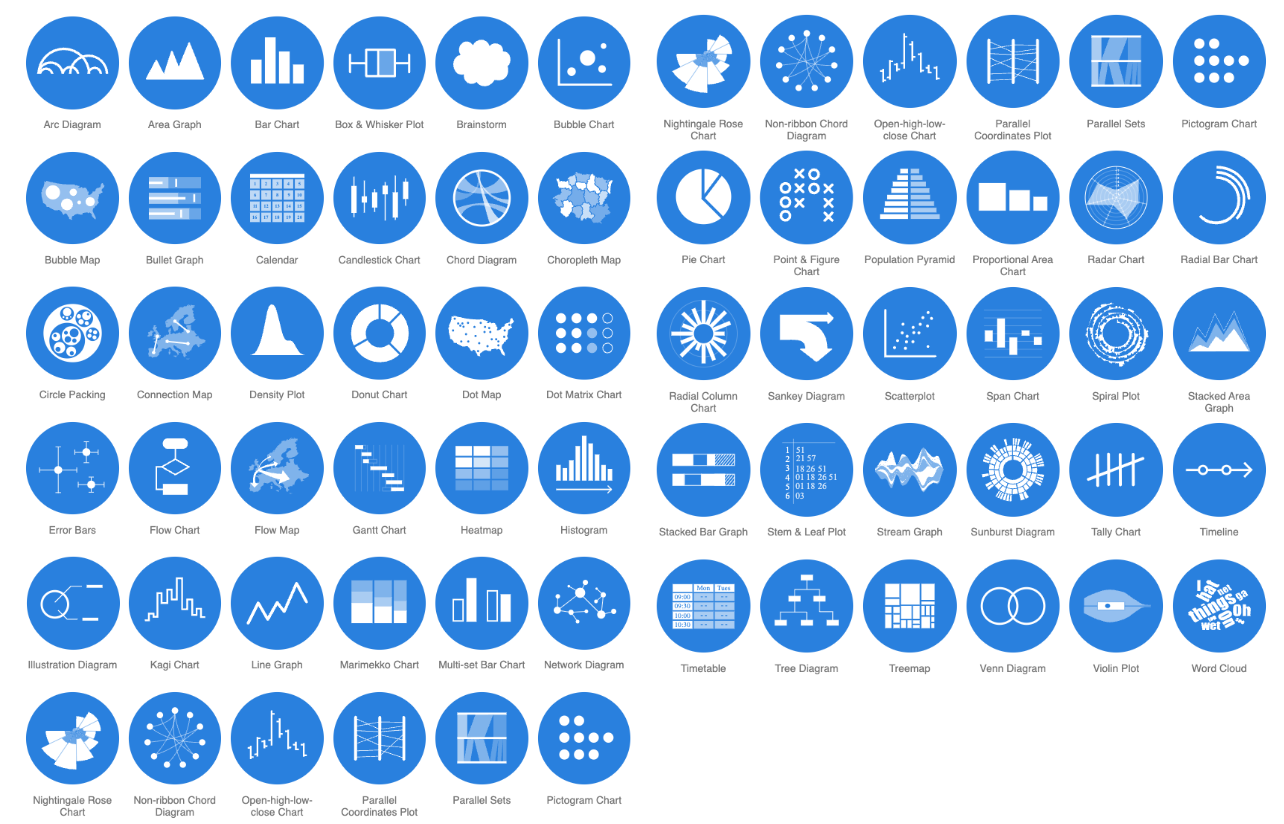
Choosing Chart Types
There are many different chart types that you can choose (e.g., 66 chart types in datavizcatalogue.
We Love Circos, But Is It Most Effective?
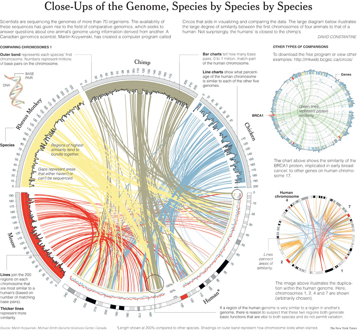
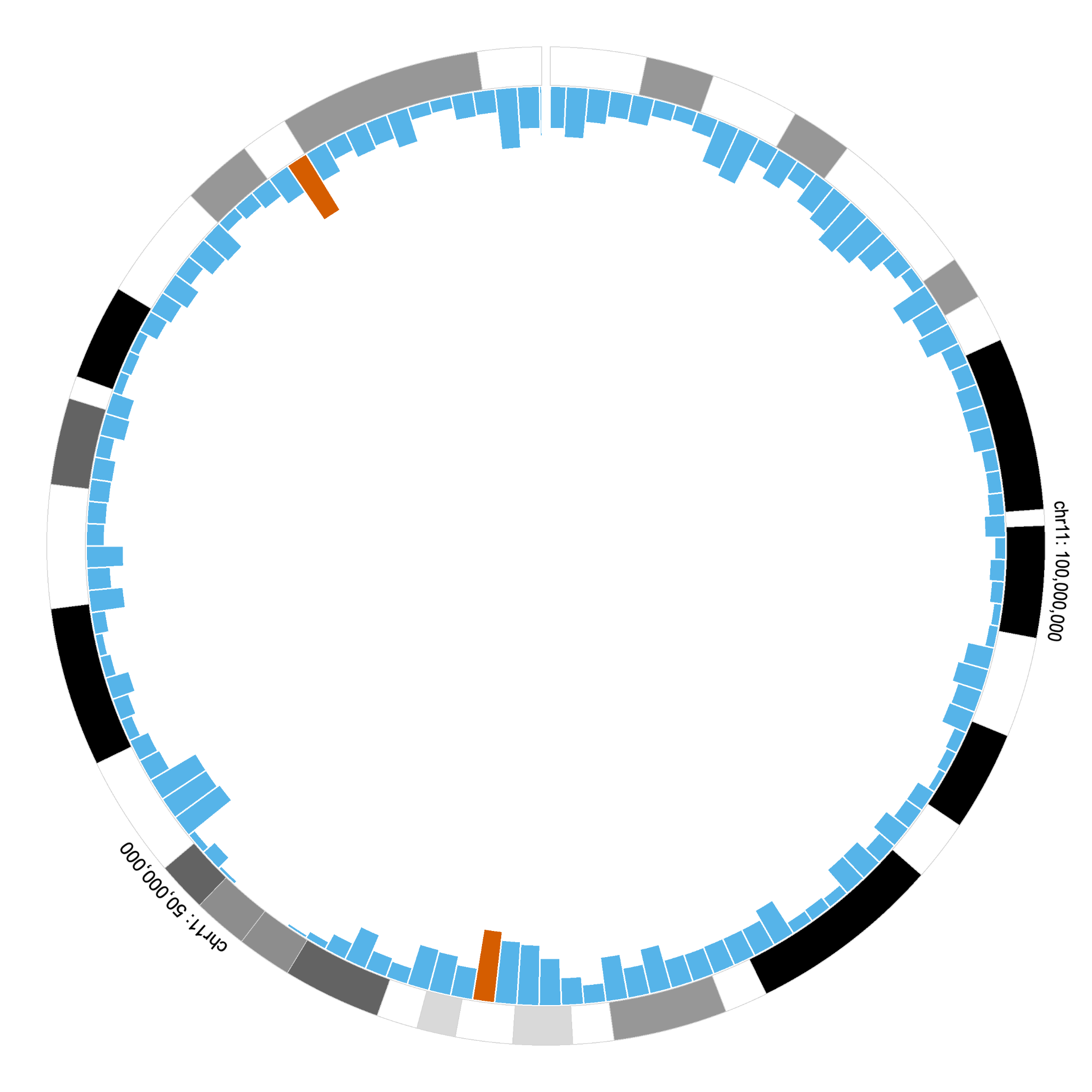
Circular vs. Linear Layouts
This examples shows a limitation of circular layouts when perceiving the difference of bars that are positioned in distant.
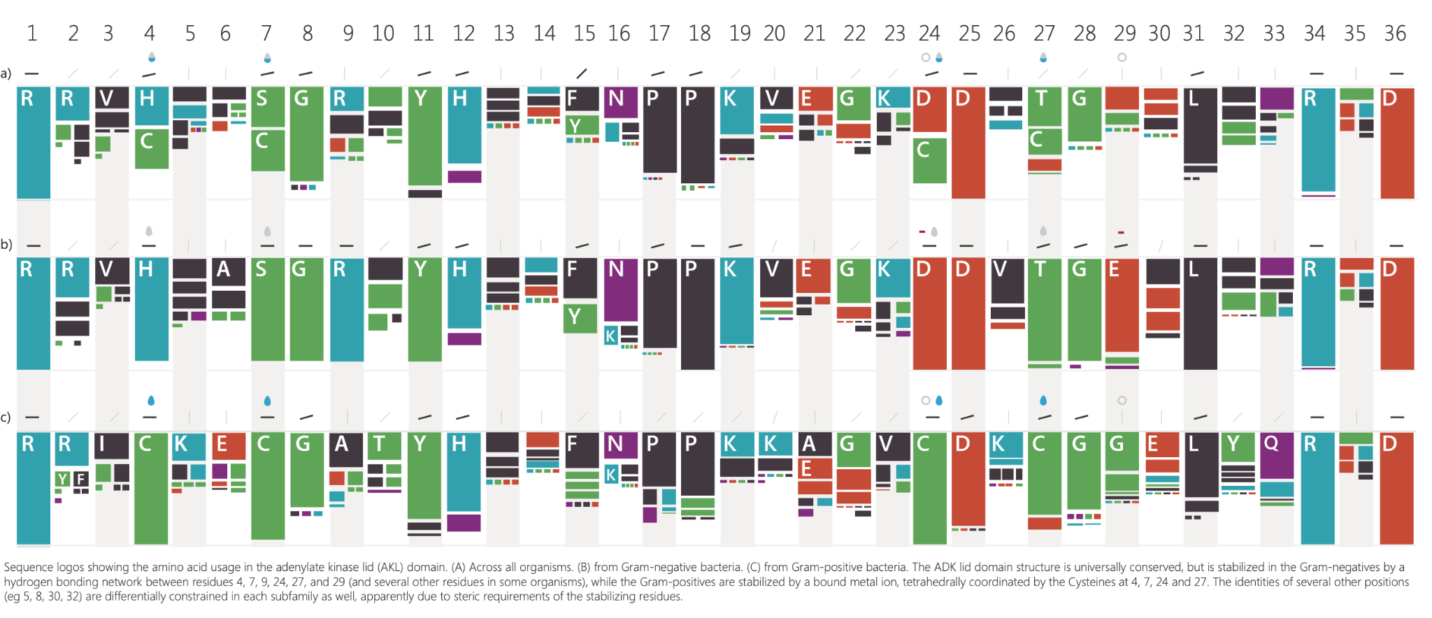
Sequence Logos
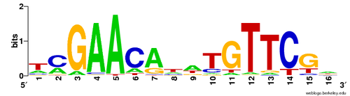
The use of inaccessible colors and distorting the height of letters in Sequence Logos is not accessible and effective visual encoding for human perception.
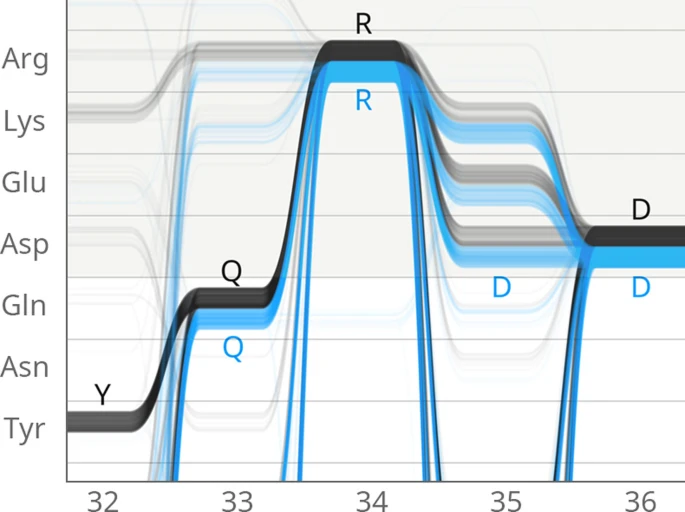
Alternative Sequence Logos
-
Maguire et al. 2014
-
Marek et al. 2014
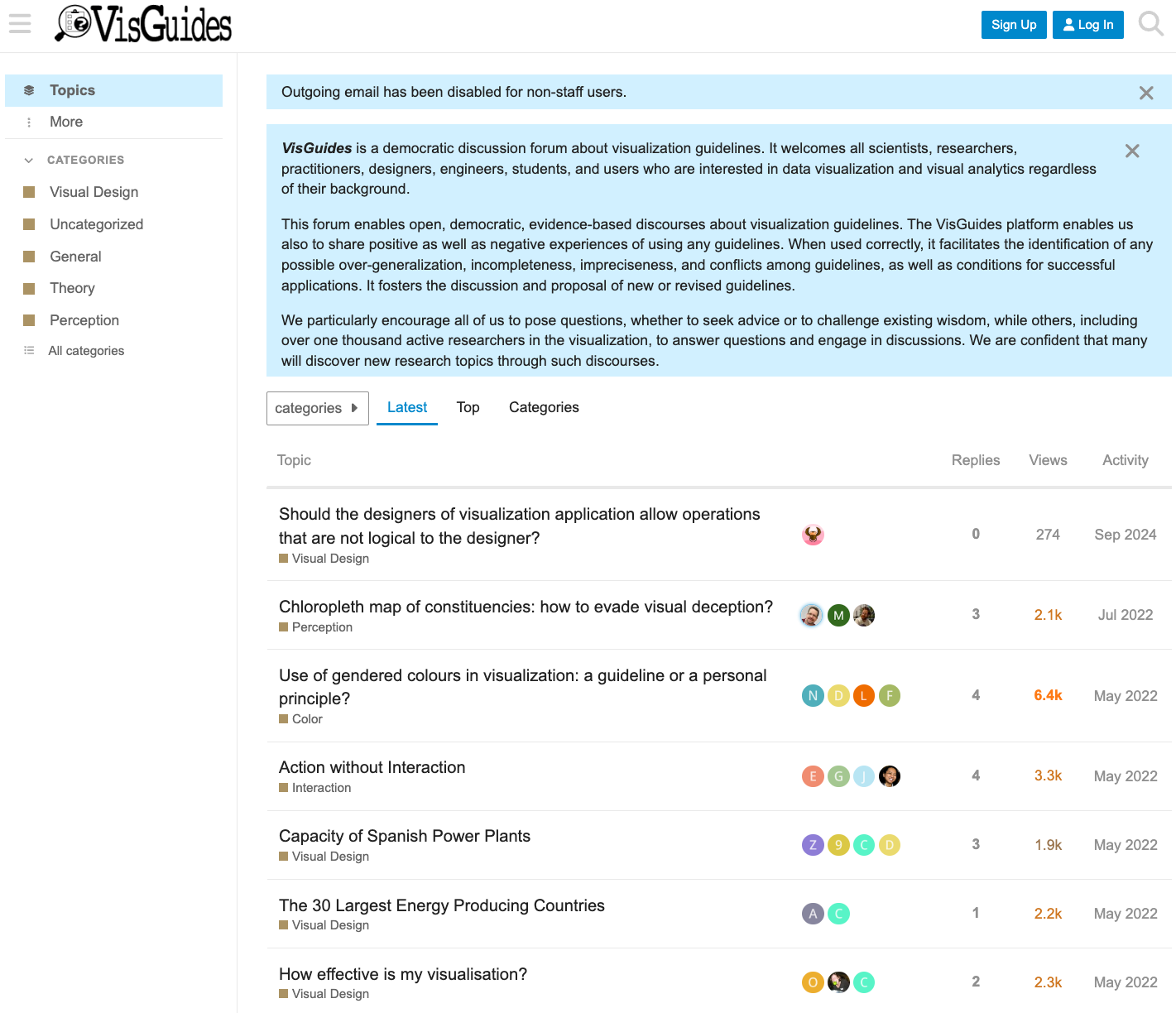
Visualization Guidelines
- VisGuides (visguides.org) is a resource and an open community for visualization guidelines.