Accessibility of Notebooks
This notebook shows a few features that can help make notebooks more accessible, such as proper headers, explanations, alt text, and comprehensible tables.
Note: this HTML page is generated with nbconvert. It has not been modified after. This page is meant to highlight the inaccessibility of certain features, and therefore e.g. alt text has not been added afterwards.
References
- Project Notebooks For All
- Tutorial Accessible Pandas DataFrames
- Repository Jupyter Accessibility
- Repository MatplotAlt and documentation
- Paper of survey of notebook accessibility - Potluri et al., 2023
- Slides of notebook best practises - Isabela Presedo-Floyd, 2023
- Tutorial for making Computational Notebooks accessible
About
Written by members of the HIDIVE Lab.
Last edited on June 25th, 2025.
Navigation
A notebook always starts with a <h1> header (a single # creates this), which should be the only <h1> element in the notebook. This is then followed by an explanation of the notebook, including the sources used, the author and the date, as is shown above. Any link has a descriptive name, with [](). Each subsequent section starts with appropriate headers (the next is <h2>, and if there is a subsection, <h3>, etc. No elements should be skipped for aesthetic purposes). This ensures that the notebook is navigable.
We describe what happens in the notebook before it happens. This allows a user to follow along. We can add these comments both in markdown and as comments in the code. Try to explain broad background in markdown, and keep code comments to small annotations that are relevant to particular lines. If we expect an error, we also mention this before, so someone knows what to expect. This all makes sure that the code is understandable, accessible, and reproducable.
Installs and imports
We will first install and import the necessary libraries, and set a random seed for reproducibility.
%pip install --quiet numpy pandas matplotlib matplotalt ipywidgets
Note: you may need to restart the kernel to use updated packages.
import numpy as np
import pandas as pd
import matplotlib.pyplot as plt
from matplotalt import show_with_alt, generate_alt_text, add_alt_text
Data Tables
We always want to show a table of our data, so we can see what it looks like. In the life sciences, we often work with large tables. With df or df.head() we can show the table. However, if there are too many rows or columns, it becomes hard to navigate. Think about the total number of cells that is shows, and thus the number of tabs someone has to do navigate the table with a keyboard. Usually, we include a table preview to show the general idea of the data. With this, we can also show a subset.
# Set seed for reproducibility
np.random.seed(42)

# Create a sparse matrix with random data
genes = [f"Gene_{i}" for i in range(0, 1000)]
samples = [f"Sample_{i}" for i in range(0, 100)]

# Poisson distributino with binomial mask for sparsity
data = np.random.poisson(lam=300, size=(1000, 100))
mask = np.random.binomial(n=1, p=0.3, size=data.shape)
data_sparse = data * mask

df_genes = pd.DataFrame(data_sparse, index=genes, columns=samples)

# Display the first 5 rows and columns of the DataFrame and set a caption
df_genes.iloc[:5, :5].style.set_caption("First 5 genes across 5 samples from a sparse matrix.")
| Sample_0 | Sample_1 | Sample_2 | Sample_3 | Sample_4 | |
|---|---|---|---|---|---|
| Gene_0 | 294 | 312 | 280 | 0 | 319 |
| Gene_1 | 288 | 307 | 0 | 0 | 0 |
| Gene_2 | 289 | 0 | 306 | 0 | 0 |
| Gene_3 | 0 | 0 | 0 | 0 | 0 |
| Gene_4 | 0 | 0 | 284 | 0 | 0 |
Alt text for static images
You can add static images in two different ways:
- A combination of
![]() - As an HTML img tag
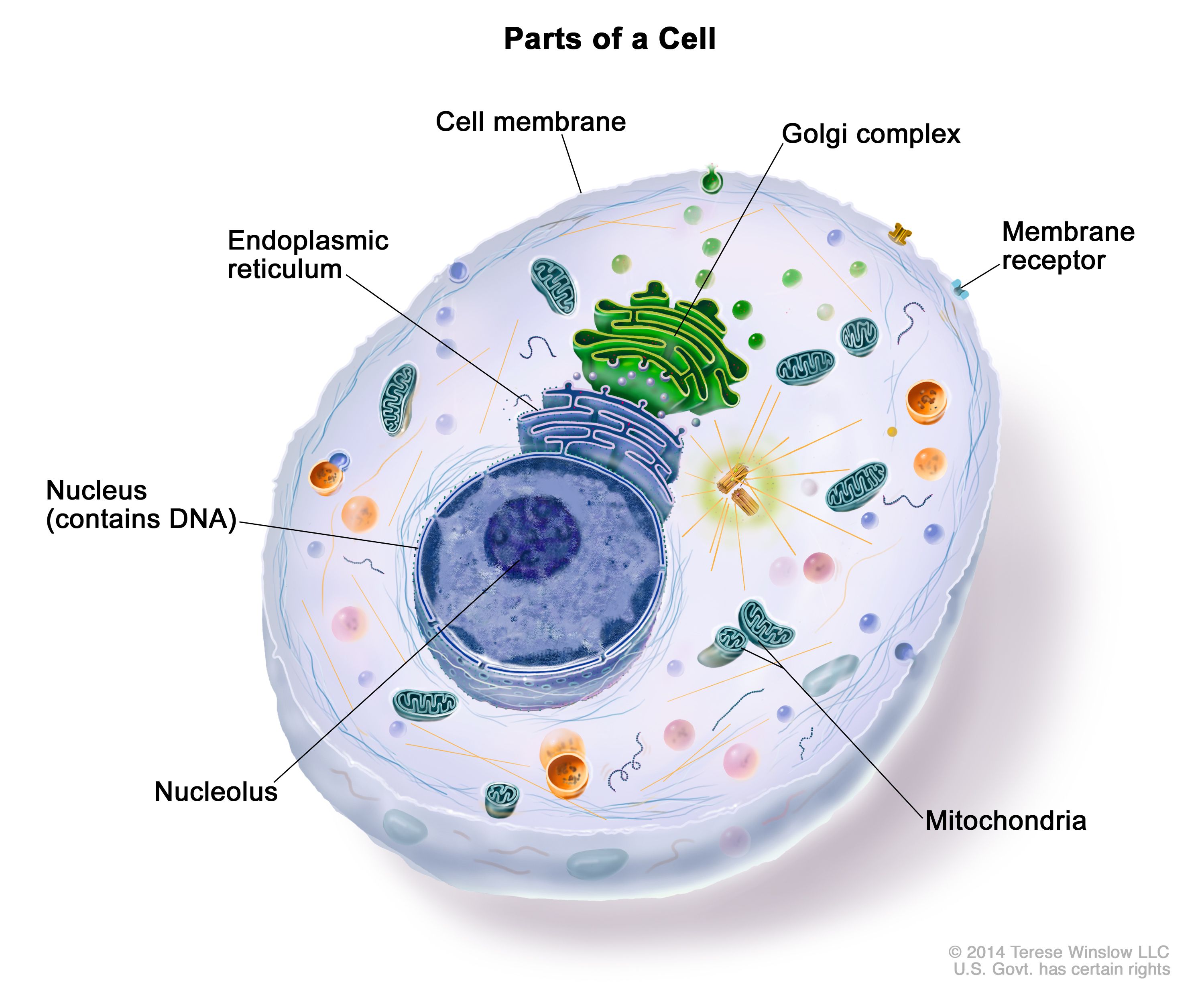
In both, you can add alt text. Here, we show this with an image of a cell from Terese Winslow, 2014.
A combination of ![]()
We can add an image with the following syntax: ![](). Here, anything added in the square brackets is interpreted as the alt text. For example:

If we break the link, we can see how the alt text replaces the image:

As <img> tag
We can also add an image with a HTML img tag. Here, we can add the "alt" attribute. We can also set other attributes for styling, such as the width:
<img alt="Schematic of a eukaryotic cell with various labelled organelles different of a cell" src="https://nci-media.cancer.gov/pdq/media/images/761780.jpg" width="200">
Again, we can break the link:
Alt text for generated figures
MatplotAlt
The library MatplotAlt generates alt text for figures created with matplotlib. First we create a dataset with two gene expressions over time.
# Create a DataFrame with time and gene expression data
time = [0, 1, 2, 4, 8, 12, 24]
gene1 = [5.0, 5.5, 7.0, 10.2, 15.0, 14.8, 13.2]
gene2 = [6.1, 6.0, 6.5, 7.0, 7.2, 7.0, 6.8]

df_expression = pd.DataFrame({
    'time': time,
    'TP53': gene1,
    'BRCA1': gene2
})

df_expression.style.set_caption("Gene expression of TP53 and BRCA1 over time.").format("{:.1f}").hide(axis='index')
| time | TP53 | BRCA1 |
|---|---|---|
| 0.0 | 5.0 | 6.1 |
| 1.0 | 5.5 | 6.0 |
| 2.0 | 7.0 | 6.5 |
| 4.0 | 10.2 | 7.0 |
| 8.0 | 15.0 | 7.2 |
| 12.0 | 14.8 | 7.0 |
| 24.0 | 13.2 | 6.8 |
Now we make a simple line plot. Normally, we would use plt.show() to show the matplotlib figure. Here, we replace this with show_with_alt(), which generates alt text and adds this to the figure. We will wrap the plot in a function because we will use it a few times.
# Create line chart
def generate_plot(df):
    plt.plot(df['time'], df['TP53'], marker='o', label='TP53')
    plt.plot(df['time'], df['BRCA1'], marker='s', label='BRCA1')
    plt.xlabel('Time (hours)')
    plt.ylabel('Expression (TPM)')
    plt.title('Gene Expression Over Time')
    plt.legend()
    plt.grid(True)
    plt.tight_layout()
    return plt

plt = generate_plot(df_expression)

# plt.show() # normal matplotlib show

show_with_alt() # matplotalt show with alt text

<Figure size 640x480 with 0 Axes>
You may wonder, I don't see any difference? This is because the default output is HTML, so if we export this notebook to HTML it has the alt text embedded. To also show it in markdown, we can add this to the methods. This also shows a table with the visualization.
plt = generate_plot(df_expression)

show_with_alt(methods=['HTML', 'markdown'])
A line plot titled 'gene expression over time'. Time (hours) is plotted on the x-axis from -5 to 30 and expression (tpm) is plotted on the y-axis from 4 to 16, both using linear scales. Tp53 is plotted in dark blue and brca1 is plotted in orange. Tp53 has a minimum value of y=5 at x=-5, a maximum value of y=15 at x=15, and an average of y=10.1. Brca1 has a minimum value of y=6 at x=0, a maximum value of y=7.2 at x=15, and an average of y=6.657. data table:
| time (hours) | tp53 (expression (tpm)) | brca1 (expression (tpm)) | expression (tpm) ticklabels |
|---|---|---|---|
| 0 | 5 | 6.1 | 4 |
| 1 | 5.5 | 6 | 6 |
| 2 | 7 | 6.5 | 8 |
| 4 | 10.2 | 7 | 10 |
| 8 | 15 | 7.2 | 12 |
| 12 | 14.8 | 7 | 14 |
| 24 | 13.2 | 6.8 | 16 |

<Figure size 640x480 with 0 Axes>
MatplotAlt options
A few more options from MatplotAlt:
- There are more export options, such as png.
- If the chart type cannot be automatically detected, we can add it with e.g.
chart_type=heatmap. - We can also separate the generation of alt (with
generate_alt_text) text and the addition of alt text to the figure (withadd_alt_text). This way, we can also write our own alt text and add it, however, this will not get updated automatically. - We can set the level of description (1-3, default 2) (as in Lundgard & Satyanarayan's 2022 paper).
Feel free to play around and access the MatplotAlt documentation.
MatplotAlt issues
However, the table that is created does not show up as a table but as plain text (tested June 25, 2025 with JAWS Screen Reader on Google Colab). Also, when exporting to both HTML and markdown, the HTML alt does not show up anymore. So while it is a nice effort to make matplotlib more accessible, it isn't a full on solution.
It is useful for HTML exports only, but if we want to also add this to our markdown, we can use the generated alt text without table and generate the table ourselves.
plt = generate_plot(df_expression)

alt = generate_alt_text(include_table=False)
print(f"Figure alt text:\n{alt}")
df_style = df_expression.style.set_caption("Gene expression of TP53 and BRCA1 over time.")
df_style.format("{:.1f}").hide(axis='index')
Figure alt text:
A line plot titled 'gene expression over time'. Time (hours) is plotted on the x-axis from -5 to 30 and expression (tpm) is plotted on the y-axis from 4 to 16, both using linear scales. Tp53 is plotted in dark blue and brca1 is plotted in orange. Tp53 has a minimum value of y=5 at x=-5, a maximum value of y=15 at x=15, and an average of y=10.1. Brca1 has a minimum value of y=6 at x=0, a maximum value of y=7.2 at x=15, and an average of y=6.657.
| time | TP53 | BRCA1 |
|---|---|---|
| 0.0 | 5.0 | 6.1 |
| 1.0 | 5.5 | 6.0 |
| 2.0 | 7.0 | 6.5 |
| 4.0 | 10.2 | 7.0 |
| 8.0 | 15.0 | 7.2 |
| 12.0 | 14.8 | 7.0 |
| 24.0 | 13.2 | 6.8 |
Checklist
Here is a checklist for accessibility of notebooks:
- Single
<h1>element at the top of the notebook - First cell explains the background of the notebook
- Rest of the notebook is structures with
<h2>-<h6>elements - Markdown and code comments explain the notebook
- Expected errors are marked
- Links have a descriptive name
- Table of the data is included
- Tables have a caption
- Tables have limited number of rows and columns
- Static images have alt text
- Dynamic images have alt text where possible
- Notebook is not too long
- An HTML version of the notebook is available if possible
This checklist does not guarentee full accessibility, but rather is meant to give a quick hands-on method to directly improve the accessibility of your notebooks.
Final notes
This was a brief introduction for notebook accessibility. In general, adding any of these will help to create a more accessible notebook and better user experience. It is easy to think "Oh, I will fix this when I publish it", but it helps to directly work on this as you are creating notebooks. Please refer to the resources mentioned at the top of this notebook for more information!